Data analysis has become the talk of the town, and the data has become the core of prediction, whether it is human preferences relating to digital marketing, sales, or business issues, any sort of projection or assumption could be made, if data relating to previous human activities could be used to predict the future in an effective manner. Hence, the data gathering relating to any particular individual, or a company could entail certain behaviour this particular person or company has. It becomes easier to predict or forecast a particular behaviour once the data regarding the previous behaviour of the person can be attained.
Hence, there are numerous softwares and programming languages that can be used to predict and analyse such behaviorus. Even in sports data analysis has become a pivotal role in a team’s effective performance, because after analysing the data, one can easily tell about the weaknesses of others.
Therefore, those programming languages and software can also be used to create such visualisation (graphs, bar charts, statistics) that can help everyone to understand the particular problems that a company or an individual is lacking and those particular points should be covered, and those particular domains should be worked upon in future so that an individual or the company could be able to see a better future in terms of monetary benefits, health benefits or in any particular domain wherever the problem lies. Structured query language, Python, excel, R software, SPSS, Eviews, STATA, Minitab, Tableau, and Matlab are the common examples that are both used as programming languages and softwares for data analysis. Common audiences use Excel for data analysis because it’s a very easy software to understand and in the future, excel will be equipped with Python for extensive data analysis features.
This blog is going to provide 10 comprehensive steps through which data analysis could be undertaken, and this blog could be one of the most comprehensive blogs that are ever written by any individual regarding data analysis and how data analysis could be tackled through programming languages or through software like excel, tableau, Matlab, Minitab, Eviews, Stata, R package or SPSS.

- Attain the data and understand what the problem that is required to be solved through this data
- Clean the data and decide which particular programming language or software should be used to undertake this data analysis
- If you are using the programming language then Python is the best option, Matlab, R package could also be used
- For effective data visualisation software like Tableau for creating interactive dashboards are also very valuable
- If you are a novice then Excel is a very easy software to undertake, PLS-SEM, SPSS for researchers
- Now you have to understand and make a decision about what kind of test has to be performed; for instance; correlation, regression, etc, or performing a qualitative data analysis
- If you are undertaking research, especially quantitative research then software like PLS-SEM is very effective in creating research models
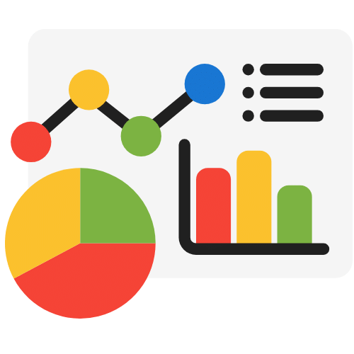
- Perform the data analysis and you can use different kinds of visualisation bar graphs, and pie charts to provide the results so that any layman could even understand your analysis
- Data analysis should be presented in a very simplified manner so that future predictions can also be made on the basis of that analysis
- Use the dashboards and graphs to create a plan for the future and interpret the problems and their solutions presented through the help of your data analysis techniques
Gather the data and understand the problem that needs to be solved
Data mining sounds like a worker is mining coal or gold or diamonds from a big mountain, that is worth billions of dollars. Similarly, data is worth billions of dollars but it’s useless unless it has been mined effectively and cleaned for its data analysis. So, every process matters in that case. So, before you start the analysis you should mine the data, for quantitative research analysis you could use instruments like questionnaires and surveys.
Otherwise, data could also be acquired through online repositories like Kaggle, where tons of data sets of data related to various domains are available. But if it is a problem that needs to be solved relating to a particular business, then data will be collected through the operations of that particular business. This is also called Business intelligence, in this specific case the data will be related to a particular business, it could be attained through questionnaires or through its particular operations, for instance, if it’s related to its shipping problems, then data related to timings of the operations will be used for the data analysis. Therefore, the researcher should understand the main problem and should also consider the correct instrument through which the data is needed to be analysed.

Cleaning the data and the decision to use a particular programming language or software for data analysis
Data scientists have a lot of choices but they should also know their role as a researcher they can use Python, for dissertations and research papers Matlab, excel, spss can be used. SQL is a structured query language that is mostly used as a database for any particular data analysis related to organisations and their employees. Minitab, R package, Eviews, and STATA also provide interactive buttons and options for using coding for programming for the execution of the problem. Additionally, if graphs are needed for the analysis and interactive dashboards are required even in that particular case the Tableau software is very effective. There are various Python libraries that could be used for data analysis, python programming language is a very easy-to-learn programming language but even then some novice programmer would not be able to use it effectively, hence they can do their research that which particular library can be used to tackle their own data analysis problem. Below are a few libraries;
NumPy: NumPy is a fundamental library for scientific computing in Python. It provides efficient data structures and functions for working with numerical data. NumPy is the foundation of many other Python libraries for data science, such as Pandas and SciPy.
Pandas: Pandas is a library for data manipulation and analysis in Python. It provides high-performance, easy-to-use data structures and data analysis tools, such as DataFrame and Series. Pandas is the most popular Python library for data science.
Matplotlib: Matplotlib is a library for data visualization in Python. It provides a wide range of plotting and charting capabilities, from simple line plots to complex 3D visualizations. Matplotlib is the most popular Python library for data visualization.
SciPy: SciPy is a library for scientific computing and technical computing in Python. It provides a wide range of mathematical algorithms and functions, such as statistics, optimization, and signal processing. SciPy is built on top of NumPy and is used in conjunction with NumPy and Pandas

The choice between the use of programming languages and software for data Analysis
Programming languages cannot be handled by everyone, hence there is a choice for data scientists and they can opt for Excel, spss, reviews, stata, tableau which are more interactive and can be easily utilised through buttons and other interactive options available for the data analysis. For instance; if you are asking how to get data analysis on Excel, then Excel is very easy to understand your copy and paste your data into different cells, if you just need to conduct a correlation among two sets of data then select those two columns of data and hit data analysis tab choose either correlation or regression, check their significance value the closer it is to 1 means they are more correlated with each other, the closer they are to 0, means they are not correlated with each other. Machine learning is yet another beast for data analysis in which you have to train your model and test it if you want to choose that option for the data analysis, but for it, you have to use programming languages like Python.

Data visualisation software like Tableau for creating interactive dashboards are also very valuable
Most of the users who pose the question of how to do data analysis without programming languages just attain your data from Kaggle from any related problem and use the Excel sheet in Tableau and you will see various options in Tableau to analyse your data and you will be able to present and visualise that data effectively to any laymen at your work also. You don’t have to watch any data analysis tutorial about Tableau software, it’s very straightforward, also you can register for a free license for a year as a student. Therefore, this tip to effectively use the diverse options available for data analysis is one of the best data analysis basics that might not be available over the internet. Therefore, the choice of Tableau is a very viable one if you don’t possess any programming skills and you just need to acquire data from any open-source repository and just follow the data analysis steps provided in this blog.

Excel is one of the easiest for novice data analysts, and PLS-SEM, and SPSS for researchers
Let’s say you are working on the data on obesity of people between 20 to 50 years of age and you need to understand what was the main cause of their obesity and how their obesity affected their health, did they die of the obesity? You have to answer all of these questions and you have no skills whatsoever when it comes to data analysis. The question of, “how to get data analysis in Excel” is also being posed by your mind and you are constantly searching how to analyze data in Excel, then look no forward because you just need to open an XLS or CSV file in Excel that includes data in it, filter the data accordingly and choose the kind of tests you want to perform, don’t try to and search and wander about the question that how to find data analysis in excel because it’s very easier than you think, you will have to install a data analysis package in excel from addons and then just hit data analysis button and you will see the list of tests that you can perform, if you want to understand which is which. For instance, when should I perform a regression test in Excel, when should I perform an ANOVA test in excel, or when should I perform a two-tailed or one-tailed t-test in Excel, just to get the idea of what kind of test is appropriate for your data? Then just use those particular data analysis tools to analyse your data with appropriate techniques of data analysis. One of the main questions that are posed by the data scientists who are also novices that how to analyze data in Excel, so they can refer to our blog post here. In the case of researchers if they are analysing their quantitative data then they could use PLS-SEM for construct reliability and validity testing, testing the items of their questionnaire that if those items are unique or not. Hypothesis testing on the basis of probability testing of P-values and T-values could also be conducted. Hence, research models could be effectively tested and created in PLS-SEM. This could be a perfect answer to the question of how you analyze data in research. Similarly, if you are thinking about how to analyze survey data, then SPSS is your answer, some supervisors prefer to use it as compared to EXCEL, hence it is preferred to conduct demographics analysis on the sample population also.

Decision about performing various statistical tests; correlation, regression, or performing a qualitative data analysis
If you are a researcher who is conducting research related to his/her master’s or Ph.D. research then you would also be looking for the answer of how to use spss software for data analysis, or any other software for the data analysis then at first the data on the excel file has to be imported within the SPSS software, and then only the data analysis could be performed. At first, a frequency analysis is performed to analyse and gather data about the participants who are involved in the research. After gathering considerable data about the sample population an analysis of tests could be performed which could be an effective answer to the query of, how do we analyze data. Now, when it comes to qualitative research analysis, if your question is about how to analyze the data in qualitative research. Qualitative research is analysed through analysis of interviews and tests of thematic analysis could be conducted also. In which codes and themes are being analysed to analyse the research problem. This particular answer fits perfectly with the query of, “how to analyze qualitative data”.
For quantitative research softwares like PLS-SEM is very effective in creating research models
If a researcher is conducting quantitative research then PLS-SEM is a very effective software that can be used to create a research model, which is used for all the variables and items of the variables. Convergent and discriminant validity is being tested to indicate that the items of particular variables are correlated with their own variable and are not correlated with other variables. Hence, the uniqueness of the data will be tested effectively through it.
For performing the data analysis, different kinds of visualisation bar graphs, and pie charts to provide the results so that any laymen could even understand your analysis
If you are a beginner when it comes to data visualization, data visualization for beginners could be broken into several aspects for instance. What is their audience, if their audience can read simple bar graphs or they could be able to understand more complex data visuals; this is the most important. Therefore, easy visualisations could be used, and then only bar graphs could be generated from excel that could be used for easy comparative analysis. Bar charts and pie charts are some of the easiest to understand and comprehend, therefore Excel can be used to generate such graphs. But if the data visualization for non-technical audiences is not the case then tableau can be used to create complex visualisations. Otherwise, for simple data visualizations bar graphs, and pie charts should be chosen on any given day. Hence, easy-to-understand data visualization could be created on any given day through Excel, and easy-to-understand data visualization for decision-making could be created for technical and non-technical audiences.
Data analysis should be presented in a very simplified manner so that future predictions can also be made on the basis of that analysis
Predictive analytics is an important aspect for businesses and it is being used to change or adapt in the future so that fewer errors could be encountered by the businesses in the future. Additionally, it can be used in all walks of life, if a person wants to become fit, they can analyse their sleeping patterns, their eating patters, and their exercise patterns to change their life accordingly. Forecasting as far as data analysis is concerned is very significant whether it is applied to a person or an individual or whether it is applied to a particular business entity to comprehend the future, that is the reason why data has become very important in today and age that we are able to predict the future, change they way it is going to happen. This also means that data-driven decision-making could be conducted and we are able to make attenuations accordingly. Whether there are problems in a system, those are being also rectified. Additionally, trend analysis is also a very important aspect it could also be conducted on any particular aspect, and it’s related to scenario planning also because if you want to plan anything ahead it can only happen in a situation when you know that what has been happening in the past.

Use the dashboards and graphs to create a plan for the future and interpret the problems and their solutions presented through the help of your data analysis techniques
If you want to create compelling Business intelligence dashboards then Tableau is a very handy software, its license can be obtained by a student, a small company, or a data scientist for a year. Data visualization dashboards are very helpful if you want to cater to large audiences and if you want to explain how you used a particular data and solve a big problem through it, and you will then present the solution, and explain it through different forms of visualisations. Data storytelling is a very compelling aspect because data scientists can present their stories that are related to the data, they can visually present the problems through the use of very effective graphs and visualisations, additionally, they can also present their solutions regarding the identified problems through using effective problems. Hence, data storytelling can be used to both identify problems and rectify them through data-driven insights by using data-driven problem-solving and effective visualisations techniques.